Let’s be real for a second. We’re all drowning in a sea of digital noise. Endless notifications, pop-ups, auto play videos, and websites that look like they’ve been hit by a rainbow. In this chaos, simplicity isn’t just a design choice—it feels like a superpower. It’s the digital equivalent of a deep, calming breath.
Think of minimalist design not as “doing less,” but as a strategic way to do more with less. It’s about cutting the fluff so the good stuff can truly shine.
1. Our Brains are Wired for Simple
Ever walked into a cluttered room and felt instantly stressed? The same thing happens when your brain lands on a messy, overcrowded website. It’s called decision fatigue. When faced with a dozen buttons, five different fonts, and a color palette that went wild, our brains short-circuit a little.
Clean, minimalist design is like a friendly guide. It reduces that cognitive load and whispers, “Hey, look here. This is what you need.” It’s why you feel so at ease on Apple’s website or can use Google’s search bar without a second thought. They’ve done the hard work of editing, so you don’t have to.
2. Less Clutter More Trust
First impressions are everything online. If your website looks like a digital yard sale, visitors might click the back button faster than you can say “conversion rate.” A cluttered design can feel sketchy, like someone has something to hide.
On the flip side, a clean, spacious layout subconsciously signals professionalism and confidence. It says, “We know who we are and what we’re doing, and we respect your time.” It’s the design version of a firm, confident handshake.
3. Speed is a Feature (And Simplicity Delivers It)
Let’s talk performance. All those fancy animations, giant image sliders, and complex scripts? They slow your site down. And in a world where every second of load time counts, a slow site is a dying site.
A minimalist approach naturally leads to a faster, lighter, and more mobile-friendly experience. This isn’t just good for users who are impatiently waiting—it’s something Google loves and rewards with better search rankings. It’s a win-win.
4. How to Embrace the Minimalist Mindset (Without Being Boring)
So, how do you actually do minimalism? It’s not just about making things white and gray. It’s about being intentional.
- Give each page or screen one primary goal. What is the one thing you want the user to do or know here?
- White space (or negative space) is not wasted space. It’s a powerful tool that gives your content room to breathe and guides the user’s eye.
- Pick 2-3 key colors and stick with them. Consistency builds recognition and calm.
- Choose one, maybe two, clear fonts. Let your typography be the hero instead of just another decorative element.
- For every element on the page, ask: “Does this help the user? Does it serve a purpose?” If the answer is “meh,” be brave and hit delete.
5. The balance Between Simple and Soul-less
Okay, let’s address the elephant in the room. Minimalism doesn’t mean your brand has to be a sterile, emotionless robot. The goal isn’t to be boring; it’s to be clear.
The magic happens in the balance. You keep the foundation clean and uncluttered, and then you inject personality through:
- A witty, conversational tone in your writing.
- A stunning, meaningful photograph.
- A small, delightful micro-interaction (like a playful hover effect).
- A carefully chosen accent color that pops.
6. The Quietest Voice in the Room
In a crowded digital party where everyone is screaming for attention, the quietest, most confident voice often ends up being the most memorable. Simplicity isn’t a passing trend—it’s a timeless principle of good design and clear communication.
So next time you’re working on a website, crafting social media content, or building a brand, remember this little mantra:
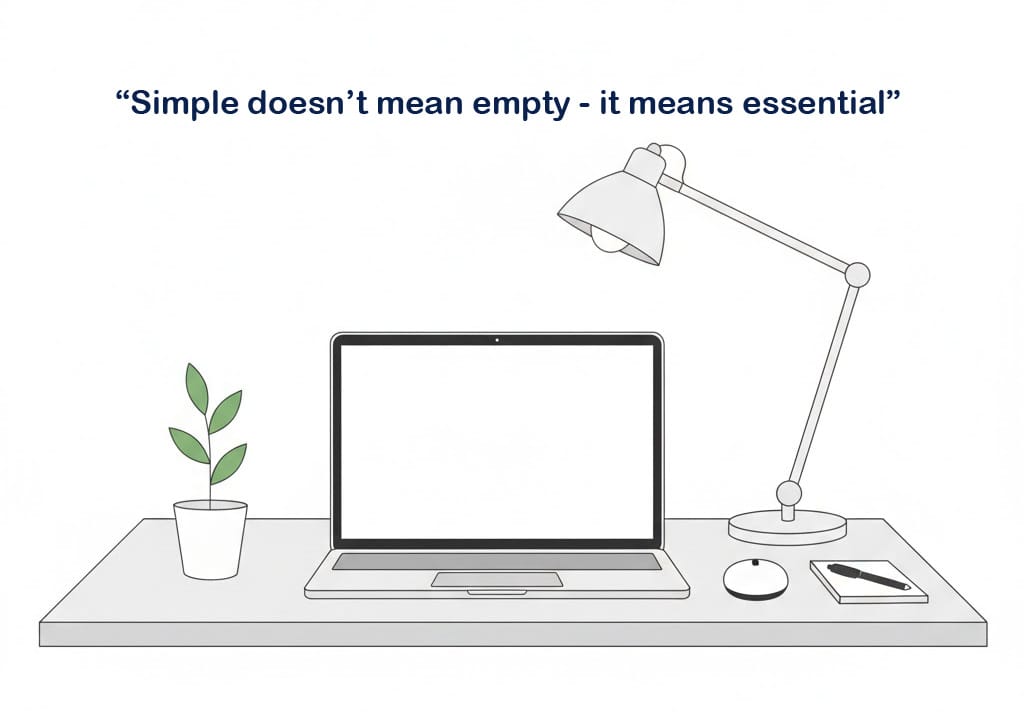
Simple doesn’t mean empty. It means essential.

